Some ideas in digital feel tied to a moment in time. They reflect the technology, behaviour, or design trends of a particular era and gradually lose relevance as the market moves on.
Others endure because they are rooted in human behaviour.
Steve Krug captured one of those enduring ideas when he published Don’t Make Me Think. The title became one of the most recognised principles in usability: if people have to stop and work out how to use your website, the experience is already creating resistance.
More than twenty years later, businesses still lose leads, sales, and trust for the same reason. Not because their products are weak or demand has disappeared, but because the path to action feels harder than it should.
What “Don’t Make Me Think” Really Means
Krug’s point was never that users are lazy or unwilling to think. It was that they should not need to spend unnecessary effort completing ordinary tasks online.
When someone lands on a website, they are trying to answer a small set of practical questions. Am I in the right place? Does this solve my problem? Can I trust this business? What should I do next?
If those answers are clear, progress feels natural. If they are hidden behind vague messaging, cluttered layouts, poor hierarchy, or confusing navigation, momentum slows.
That matters because most people do not study websites carefully. They scan quickly, make snap judgements, and choose the easiest available path. If the experience creates friction, that path is often to leave.
Why the Principle Still Matters
Modern websites are often more polished than the websites Krug originally wrote about, yet many are harder to use.
Large menus, layered navigation, autoplay video, aggressive pop-ups, multiple calls to action, dense copy, and constant interruptions can all add mental load. Individually, each element may seem harmless. Together, they create drag.
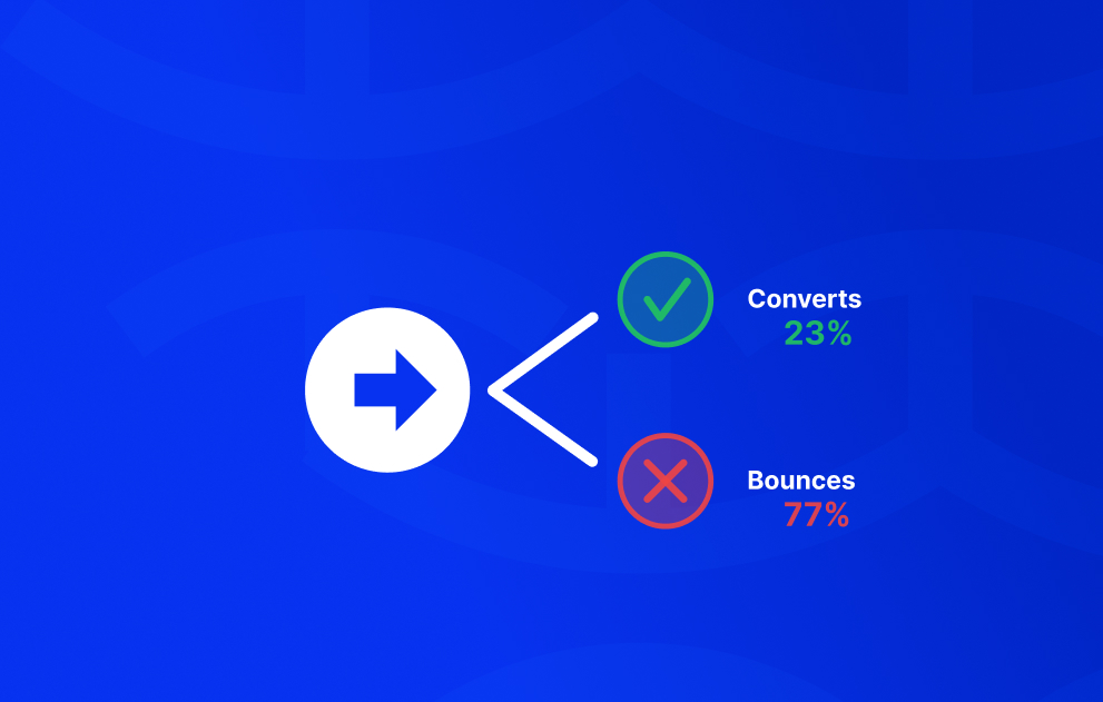
This becomes expensive when traffic has been paid for. Every click that lands on a confusing experience carries a cost. If users hesitate, abandon, or fail to understand the offer, acquisition spend is wasted before conversion has a chance to happen.
That is why usability and conversion rate optimisation are so closely connected. In many cases, growth does not come from persuading people harder. It comes from making progress easier.
Example One: Navigation That Prioritises Internal Language
Navigation is one of the clearest places where businesses accidentally make users think.
Many brands choose labels that make sense internally but create uncertainty externally. Terms such as “Solutions Hub”, “Growth Centre”, or “Your Journey” may sound polished in a workshop, but they often require interpretation from first-time visitors.
Users rarely arrive wanting to decode brand language. They are usually looking for familiar pathways such as pricing, services, products, support, or contact.
Clear labels reduce effort. Ambiguous labels create hesitation. When people hesitate at the navigation stage, they are less likely to continue exploring.
Example Two: Headlines That Sound Good but Say Little
A common issue on homepages and landing pages is copy that feels impressive without being informative.
Statements such as “Transforming Possibility Into Performance” or “Powering the Future of Innovation” may appear sophisticated, but they often leave visitors unsure what the business actually does.
Strong headlines orient the user quickly. They explain the category, audience, or value in plain language. Conversion optimisation for ecommerce brands. Accounting support for growing businesses. CRM software for real estate teams.
Clarity creates confidence. Vague messaging creates work.
Example Three: Too Many Competing Actions
Some pages try to offer every possible next step at once. Book a demo, download a guide, watch a video, join a newsletter, start a trial, contact sales.
While this can feel comprehensive, it often weakens decision-making. Instead of moving forward, users pause to compare options or defer action entirely.
Well-performing pages tend to establish hierarchy. There is one clear primary action supported by secondary paths for users who need them.
When the next step is obvious, momentum is easier to maintain.
Example Four: Product Pages That Leave Questions Unanswered
In ecommerce, uncertainty is one of the biggest barriers to purchase.
Customers want to know when the product will arrive, whether returns are simple, how sizing works, whether others trust it, and why it is worth the price.
Many product pages still focus heavily on imagery and short descriptions while hiding practical reassurance elsewhere.
Strong product pages surface trust early. Delivery expectations, returns information, reviews, guarantees, specifications, and clear benefits are easy to find.
If users need to search for reassurance, many will not stay long enough to find it.
Example Five: Forms That Feel Like Effort
Lead generation often breaks down at the form stage.
Long forms, unnecessary fields, poor mobile layouts, unclear error messages, and generic buttons create a subtle feeling of friction. Users who were ready to enquire begin reconsidering the effort required.
Better forms respect momentum. They ask only for what is necessary, guide completion clearly, and reduce uncertainty wherever possible.
In many cases, improved conversion rates come not from stronger sales copy, but from removing administrative friction.
The Cost of Small Frictions
Usability problems are often underestimated because each one appears minor on its own.
A headline that lacks clarity. A button that blends into the page. A form asking for too much. A returns policy that is hard to find. A menu label that feels unclear.
None of these issues seem dramatic in isolation. Together, they can materially reduce performance.
This is why some businesses continue investing in more traffic while overlooking the experience that traffic lands on. They are trying to scale demand before fixing leakage.
A Simple Test for Your Website
Review your homepage or key landing page as if you have never seen it before.
Is it immediately clear what the business does?
Is it obvious who it is for?
Can users quickly see why they should trust you?
Is the next step clear and easy to take?
If any of those answers feel uncertain, visitors are likely feeling the same hesitation.
Why Steve Krug Still Matters
Steve Krug remains influential because he described a commercial truth in simple language.
Ease wins.
Not because simplicity is fashionable. Not because clarity is less creative. But because removing hesitation helps people move forward.
The highest-performing websites are often not the ones doing the most. They are the ones asking the least of the user.