Heatmaps are one of the most familiar tools in digital optimisation. They are colourful, intuitive, and deceptively simple. For many teams, they are the first step beyond pageviews and bounce rates, offering a more human view of how people interact with a site.
Used thoughtfully, heatmaps can surface friction, misalignment, and missed opportunities. Used casually, they can reinforce assumptions, distract teams with surface-level patterns, and encourage changes that look sensible but do little to improve performance.
Understanding what heatmaps are for, and just as importantly what they are not, is what separates insight from noise.
What Heatmaps Actually Measure
At their core, heatmaps are aggregations of behaviour. They visualise where users click, how far they scroll, and in some cases how they move their cursor across a page. Instead of rows of events or session replays, they compress thousands of interactions into a single visual layer.
That compression is powerful. Patterns emerge quickly. Attention clusters, dead zones, and unexpected interactions become obvious in a way that spreadsheets rarely allow.
What heatmaps do not capture is intent, motivation, or outcome. They show where something happened, not why. They also cannot tell you whether an interaction contributed to a meaningful result.
This is where many teams get tripped up. Heatmaps are often treated as explanatory, when in reality they are descriptive. They are a form of behavioural analytics, not a window into user intent.
The Signals Heatmaps Can (and Cannot) Provide
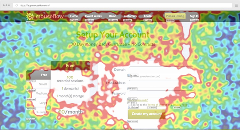
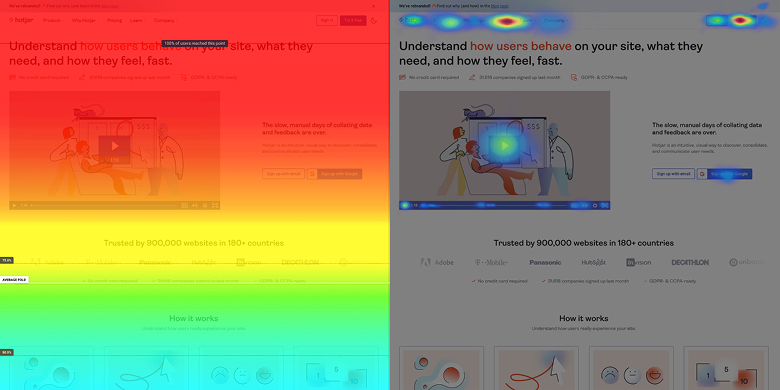
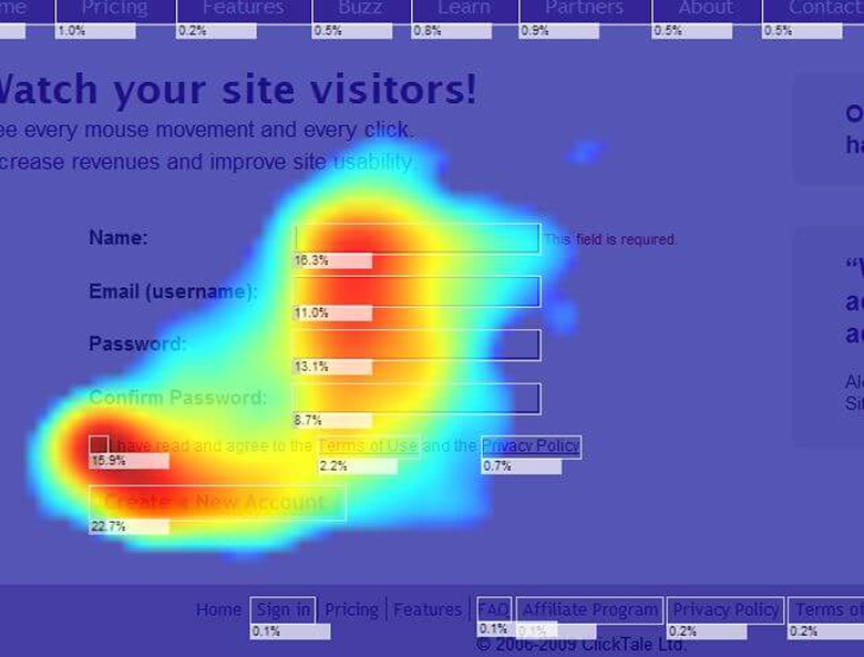
Click heatmaps tend to be the most recognisable. They reveal what users attempt to interact with, including elements that were never designed to be clickable. When users repeatedly click images, headings, or icons that do nothing, it is rarely enthusiasm. More often, it is expectation mismatch and unnecessary friction.
Scroll heatmaps tell a different story. They show how far users progress down a page and where attention begins to thin. This is particularly useful on long-form landing pages, pricing pages, or editorial content, where hierarchy and pacing matter more than raw visibility and cognitive load.
Mouse movement and hover heatmaps sit somewhere in between. On desktop, they can loosely mirror attention, but they work best as supporting evidence rather than a primary signal. On touch devices, they are largely irrelevant.
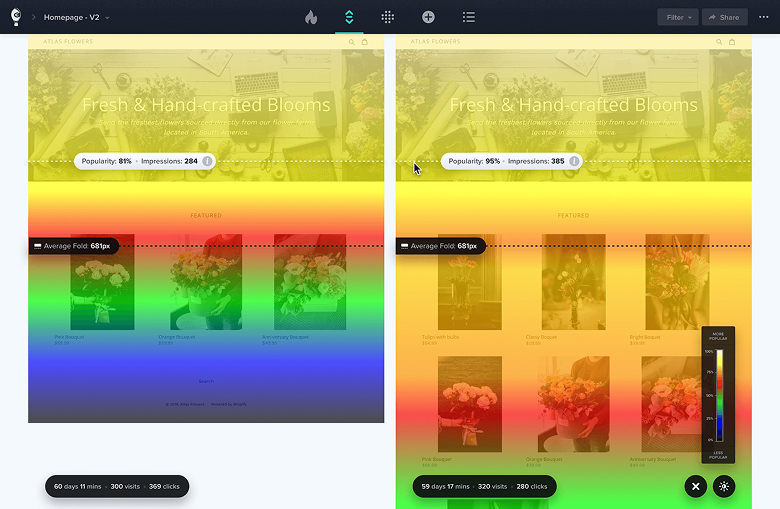
Some platforms now blend multiple inputs into attention or engagement heatmaps. These summaries can be helpful, but they should prompt investigation rather than act as conclusions.
Where Heatmaps Fit in a CRO Workflow
Heatmaps are not optimisation tools. They do not improve conversion rates by themselves, and they do not validate ideas.
Their value is diagnostic.
When performance data highlights a problem, such as low conversion rates, weak CTA engagement, or unexpected drop-off, heatmaps help you understand how users are interacting with the experience you have built. They are particularly useful for identifying ambiguity, missed emphasis, or competing signals within a broader conversion rate optimisation process.
Sequence matters. Performance data first. Behavioural insight second. Hypothesis formation third. Experimentation last.
Teams that reverse this order often end up optimising what is visible rather than what matters.
Where Heatmaps Commonly Mislead Teams
One of the biggest risks with heatmaps is over-generalisation. Aggregated behaviour hides nuance. High-intent and low-intent users are blended together. Minority behaviours, which can be commercially important, often disappear entirely within a broader funnel view.
There is also a bias toward activity. Areas with lots of clicks feel important, even when those clicks do not contribute to outcomes. Quieter areas can feel underperforming, even when they are doing their job efficiently.
Without context from funnels, conversion events, and intent signals, heatmaps can confidently point teams toward false positives.
The Tooling Landscape Has Matured
The evolution of heatmap tools mirrors the maturity of the discipline itself.
Platforms like Microsoft Clarity have made behavioural data accessible to almost everyone. It is free, generous with data, and particularly effective for identifying rage clicks, dead clicks, and basic engagement patterns.
At the enterprise end of the spectrum, Contentsquare reflects a different philosophy. Its acquisition of Hotjar was not about heatmaps alone, but about integrating behavioural signals into a broader experience analytics platform, where heatmaps are just one input among many.
Tools such as Crazy Egg and Mouseflow sit between these extremes. They offer accessible visual insight paired with session replay and lightweight funnel analysis.
Choosing between them is less about features and more about organisational maturity.
Choosing the Right Heatmap Tool
A better question than ŌĆ£Which heatmap tool should we use?ŌĆØ is ŌĆ£What decision are we trying to inform?ŌĆØ
If that answer is unclear, no tool will save you.
Teams that extract real value from heatmaps are deliberate about when they use them, how they segment them, and what they expect to learn. Heatmaps support decisions. They do not make them.
The Role Heatmaps Actually Play
Heatmaps are best thought of as a lens, not a lever.
They help you see behaviour that might otherwise go unnoticed. They surface questions worth asking. They make abstract problems feel tangible.
Optimisation still comes from understanding intent, designing better experiences, and validating change through experimentation.
Heatmaps do not optimise websites.
They help people do it better.